

Dimensionality reduction of text data#
In the Clustering Chapter we briefly introduced how to deal with text data. There, we presented the concept of vectorization, where we treat each word as a feature (a column), and represent each document as a vector (a row). As this process creates as many features as unique words occurring in the data, the dimension of the feature space can be very large.
In this notebook we use the Wikinews dataset to explore how to reduce that dimensionality for visualization and analysis. This turns out to be trickier than in the tabular setting. The heuristics we used before, such as the 90% variance threshold and the Kaiser criterion, behave very differently on text data and can lead to impractical choices.
We also compare linear and non-linear reduction techniques. Each technique tells a different story about the same data, and knowing when to use which is one of the goals of this notebook.
import pandas as pd
data = pd.read_csv("../datasets/wiki_news.csv")
data
| category | text | |
|---|---|---|
| 0 | business | The besieged airline industry received some go... |
| 1 | business | The Dow Jones Industrial Average fell more tha... |
| 2 | business | The International Criminal Court has presented... |
| 3 | business | The online payment service PayPal has received... |
| 4 | business | The world's second largest auto parts maker, D... |
| ... | ... | ... |
| 1245 | tech | YouTubeThe online video sharing site YouTube h... |
| 1246 | tech | If you've noticed a fuzzy yellowish object at ... |
| 1247 | tech | NASA officials decided late Monday to go ahead... |
| 1248 | tech | The head of the United States National Nuclear... |
| 1249 | tech | Scientists have announced that the largest rad... |
1250 rows × 2 columns
In the Clustering Chapter we encoded the text using CountVectorizer first,
then we just mentioned that skrub.StringEncoder encodes text similarly to
CountVectorizer but it additionally reduces the dimension of the feature
space.
In this notebook, we use TfidfVectorizer to vectorize the “text” column. The
min_df and max_df hyperparameters discard any word that appears in fewer
than 5 documents, or in more than 80% of documents, respectively. The logic is
that very rare terms may just be typos, proper nouns, or highly specific terms
that won’t generalize across the corpus; whereas words appearing in almost
every document may not help distinguish one document from another: articles,
conjunctions, auxiliary verbs, etc.
from sklearn.feature_extraction.text import TfidfVectorizer
vectorizer = TfidfVectorizer(min_df=5, max_df=0.8)
data_encoded = vectorizer.fit_transform(data["text"])
data_encoded
<Compressed Sparse Row sparse matrix of dtype 'float64'
with 191581 stored elements and shape (1250, 6678)>
The output from the cell above tells us that, after discarding terms according
to the min_df and max_df, we are left with 6,678 unique terms distributed
in the 1,250 documents. Most entries are zero, since any given document uses
only a small fraction of all possible terms; out of the 1250 × 6678 ≈ 8.3
million possible entries, only ~190,000 are non-zero. Working directly in this
6678-dimensional space is computationally expensive and unnecessary, as most
dimensions carry little information and many terms are correlated (synonyms,
verb conjugations, etc). Dimensionality reduction, such as PCA, can compress
this into a much smaller set of directions that capture the dominant patterns
across documents.
Let’s now use PCA to keep just 2 dimensions. But first we define a helper
function that allows us to plot the different categories and explore the data
structure at a glance.
import textwrap
import plotly.graph_objects as go
from sklearn.decomposition import PCA
def wrap(text, width=80, max_lines=3):
lines = textwrap.wrap(text, width)
if len(lines) > max_lines:
return "<br>".join(lines[:max_lines]) + "..."
return "<br>".join(lines)
def plot_2d_projection(estimator, data, categories_to_plot):
X_2d = estimator.fit_transform(data_encoded)
fig = go.Figure()
for cat in categories_to_plot:
idx = data["category"] == cat
fig.add_trace(
go.Scatter(
x=X_2d[idx, 0],
y=X_2d[idx, 1],
mode="markers",
name=cat,
marker=dict(size=5, opacity=0.6),
text=data.loc[idx, "text"].apply(wrap),
hovertemplate="<b>%{text}</b><extra></extra>",
)
)
estimator_name = type(estimator).__name__
fig.update_layout(
title=f"TF-IDF + {estimator_name} (2D projection)",
xaxis_title="PC1",
yaxis_title="PC2",
yaxis=dict(scaleanchor="x", scaleratio=1), # set equal axes
)
fig.show(renderer="notebook")
all_categories = data["category"].unique()
pca = PCA(n_components=2) # no need to set the random seed, can you tell why?
plot_2d_projection(pca, data, all_categories)
All categories crowd near the origin, but “sport” and “tech” extend into distinct regions of the PC space. Their characteristic vocabulary is distinctive enough to pull them apart with 2 components.
Remember also that the First Principal Component carries more variance than the Second Principal Component, and so on. Because of this, the fact that “sport” extends largely in the negative PC1 direction suggests sports vocabulary is the most distinctive across this corpus of documents and is well-captured by that direction. Similarly, “tech” is spread in the positive PC2 direction. This suggests that the words that define PC2 are disproportionately tech-related terms.
“Business” and “entertainment” stay near the center, suggesting their vocabulary is spread across many directions rather than concentrated along the first two components. Let’s focus on “entertainment” and use a pairplot to explore whether higher components better capture the vocabulary specific to this category.
import pandas as pd
import seaborn as sns
import matplotlib.pyplot as plt
def set_equal_axes(*args, **kwargs):
plt.xlim(-lim, lim)
plt.ylim(-lim, lim)
plt.gca().set_aspect("equal")
plt.xticks(rotation=45)
n_components = 4
category_of_interest = "entertainment"
pca.set_params(n_components=n_components)
X_pca = pca.fit_transform(data_encoded)
entertainment = pd.DataFrame(
X_pca[data["category"] == category_of_interest],
columns=[f"PC{i + 1}" for i in range(n_components)],
)
lim = max(abs(entertainment.values.min()), abs(entertainment.values.max()))
g = sns.PairGrid(entertainment, corner=True, aspect=1.2)
g.map_offdiag(sns.scatterplot, alpha=0.6, s=20)
g.map_diag(sns.histplot)
g.map_offdiag(set_equal_axes)
_ = g.figure.suptitle(
f"TF-IDF + PCA on {category_of_interest}\n(first {n_components} components)"
)
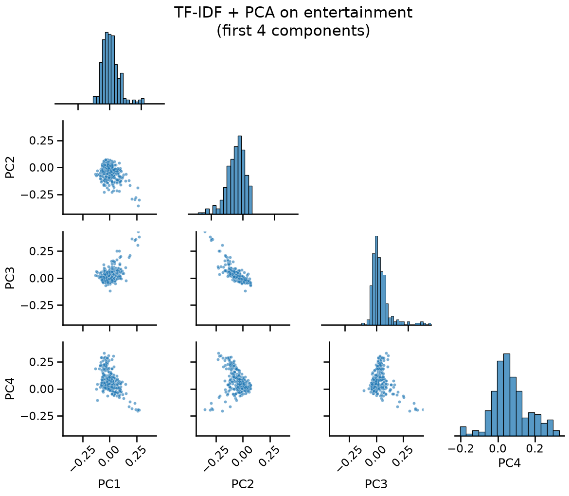
The first panel shows PC1 vs PC2, which corresponds to the 2D scatter plot we explored earlier with all categories. The cloud is roughly isotropic, with a few outliers pulling away from the center. As neither component dominates, PC1 and PC2 are driven by other categories’ vocabulary, and entertainment articles are essentially scattered at random along those first directions.
From PC3 onward, the scatter panels show a clear diagonal elongation, meaning entertainment articles tend to land on defined regions of these components rather than randomly. This correlation between components suggests they capture coherent vocabulary patterns within the category. The panels involving PC4 show elongation along the PC4 axis, suggesting it is the first component to capture variance specific to entertainment.
Now let’s get back to our 2D scatter plot to visualize “sport” and “entertainment” together in the first two components.
categories_to_plot = ["entertainment", "sport"]
plot_2d_projection(pca, data, categories_to_plot)
Observe that near the center of the overlap region between “entertainment” and “sport”, articles reference the Olympic Games, which naturally belongs to both categories. Other articles in that region simply share common terms such as city names, that frequently host prominent figures from both categories.
Choice of n_components for text data#
So far we have used 2 or just a few components for easier visualization. But
for a downstream task like clustering, we would want to keep more, as
additional components better capture the variance coming from the specific
vocabulary of different categories. In a previous notebook we used the 90%
variance threshold and the Kaiser criterion to guide the choice of
n_components. Let’s see how they behave on text data.
import numpy as np
n_components = 900
pca = PCA(n_components=n_components).fit(data_encoded)
cumvar = np.cumsum(pca.explained_variance_ratio_)
n_90 = np.searchsorted(cumvar, 0.90) + 1
n_kaiser = np.sum(pca.explained_variance_ratio_ > 1 / data_encoded.shape[1])
print(
f"Cumulated explained variance with {n_components} "
f"components: {cumvar[-1] * 100:.1f}%"
)
print(f"90% variance threshold: {n_90} components")
print(f"Kaiser criterion: {n_kaiser} components")
Cumulated explained variance with 900 components: 91.9%
90% variance threshold: 848 components
Kaiser criterion: 900 components
Both heuristics suggest keeping far more components than is practical. The 90% variance threshold already requires on the order of thousands of components. The Kaiser criterion, which sets the threshold at 1/6678 explained variance, keeps even more: all 900 components we computed pass it, meaning the true cutoff lies beyond what we measured.
For text data, a common practice is to fix the number of components to be 100 or 300. Other values are valid, but a finer grid is unlikely to yield meaningfully different results and would add unnecessary computational cost.
Let’s now run a K-Means as downstream task. We set n_clusters=5 to match the
number of categories we know exist in this dataset. This is similar to what we
did in the Clustering chapter, except that now we can use PCA’s inverse
transform to project the cluster centroids back into the TF-IDF vocabulary
space. The terms with the highest TF-IDF weights in each centroid are the most
characteristic words for that cluster, giving us a sanity check on whether the
clusters are meaningful. In a setting without known labels, inspecting
centroid terms across different values of n_clusters could be a qualitative
way to evaluate the pipeline.
from sklearn.cluster import KMeans
n_components = 300
pca = PCA(n_components=n_components)
X_pca = pca.fit_transform(data_encoded)
explained_variance = pca.explained_variance_ratio_.sum()
kmeans = KMeans(n_clusters=5, n_init=5, random_state=42).fit(X_pca)
original_space_centroids = pca.inverse_transform(kmeans.cluster_centers_)
order_centroids = original_space_centroids.argsort()[
:, ::-1
] # highest weights
terms = vectorizer.get_feature_names_out()
print(
f"Cumulated explained variance with {n_components} components: {explained_variance * 100:.1f}%"
)
for i in range(5):
print(f"Cluster {i}: ", end="")
for ind in order_centroids[i, :10]:
print(f"{terms[ind]} ", end="")
print()
Cumulated explained variance with 300 components: 55.3%
Cluster 0: space launch nasa shuttle is mission satellite rocket that mars
Cluster 1: olympic team games paralympic medal paralympics women london amp with
Cluster 2: that is by it has be was said as are
Cluster 3: game scored goal match half minute was ball first team
Cluster 4: he his was that is film her at with as
Clusters start to be interpretable, but clusters 1 and 3 belong both to the
“sport” category, as we saw olympic sports have a vocabulary close to category
“entertainment”. Clusters 2 and 4 are polluted by common function words such
as “is”, “that” and “was”, which carry little to no information. One way to
address this is to lower max_df. However, setting it too aggressively risks
removing words genuinely carry information. Another approach is to use the
stop_words="english" parameter, which explicitly filters a predefined list
of common English words. This is generally discouraged (see the documentation
for
stop_words)
because the list is arbitrary and hard coded in the scikit-learn
implementation, but is still a reasonable option to explore here:
vectorizer = TfidfVectorizer(min_df=5, max_df=0.8, stop_words="english")
data_encoded = vectorizer.fit_transform(data["text"])
X_pca = pca.fit_transform(data_encoded)
explained_variance = pca.explained_variance_ratio_.sum()
kmeans_centroids = kmeans.fit(X_pca).cluster_centers_
original_space_centroids = pca.inverse_transform(kmeans_centroids)
order_centroids = original_space_centroids.argsort()[:, ::-1]
terms = vectorizer.get_feature_names_out()
print(
f"Cumulated explained variance with {n_components} components: {explained_variance * 100:.1f}%"
)
for i in range(5):
print(f"Cluster {i}: ", end="")
for ind in order_centroids[i, :10]:
print(f"{terms[ind]} ", end="")
print()
Cumulated explained variance with 300 components: 54.8%
Cluster 0: said new company internet million google airline microsoft year billion
Cluster 1: game team match olympic games scored goal amp half ndash
Cluster 2: said government iran united president rights people military nations marriage
Cluster 3: space launch shuttle nasa mission rocket satellite station orbit atlantis
Cluster 4: film music album band died movie bbc television best said
This time the centroids contain vocabulary that truely reflects the expected categories.
Non-linear dimensionality reduction#
So far we’ve seen that PCA is a linear method for dimensionality reduction. As such, it does not distort the original feature space. It finds straight directions in it and projects all samples onto them. We now introduce a non-linear technique for dimensionality reduction, known as t-SNE (t-distributed Stochastic Neighbour Embedding) which is neighbour-based instead. It arranges points in 2D so that each point’s nearest neighbours in the original space remain its nearest neighbours in the projection. This makes it better suited for visualizing local cluster structure, at the cost of losing the interpretability of the axes.
In t-SNE, distances between clusters in a t-SNE plot are not meaningful. Two clusters appearing far apart in a t-SNE plot does not mean they are dissimilar in the original space, and two clusters appearing close does not mean they are similar. t-SNE optimizes local neighbourhood structure within clusters but does not preserve the global geometry between them.
from sklearn.manifold import TSNE
tsne = TSNE(n_components=2)
plot_2d_projection(tsne, data, all_categories)
The clusters are much more clearly separated than in the PCA projection. Sport and politics form tight, compact groups, while entertainment and business remain more diffuse, consistent with what we observed earlier. Crucially, the model had no access to the category labels: this structure emerges purely from word co-occurrence patterns. A neighbour-based approach like a news recommender system could work directly in this space, since documents that land close together are genuinely similar in vocabulary.
Two caveats are worth keeping in mind:
First, t-SNE cannot be inverted. Unlike PCA, there is no way to map a point in the 2D projection back to the original document space. This means t-SNE is useful for visualization but cannot serve as a preprocessing step for a classifier that needs to generalize to new documents.
Second, the layout depends on the initialization. The scikit-learn implementation of
TSNEuses PCA initialization by default, which is more globally stable than a random start. The interesting consequence for this particular dataset is that the PCA initialization is fully deterministic regardless of therandom_stateyou pass toTSNE. This is because the automatic solver selection for this data shape (1,250 samples, 6,678 features, 2 components) follows a deterministic path, so the starting configuration does not change across runs. A random initialization with different seeds can produce a noticeably different global layout, making comparisons across runs harder to interpret.
Finally, some dimensionality reduction algorithms are not included in scikit-learn. One of them is UMAP (Uniform Manifold Approximation and Projection), which is also neighbour-based like t-SNE, but represents the data as a graph, where each document is a node connected to its nearest neighbours in the TF-IDF space. UMAP then finds a 2D arrangement of those nodes that best preserves the connections in that graph, including connections between distant nodes. This means it optimizes for both local and global structure simultaneously. In practice, similar documents end up placed close together, but clusters that are far apart in the original space tend to remain far apart in the projection as well.
Note: UMAP is not available in JupyterLite. To run the following cell, execute the notebook locally.
# %pip install umap-learn
# from umap import UMAP
# umap = UMAP(random_state=42)
# plot_2d_projection(umap, data, all_categories)
Categories “sport” and “tech” form the most distinct clusters, while business, politics and entertainment overlap more, reflecting their shared vocabulary. For this specific random seed, a large space-related blob appears in the lower-left of the plot, and a small isolated blob can be distinguished in the upper-right corresponds to cycling articles. Its position may vary across random seeds, but it tends to remain isolated, as its vocabulary is specific enough to pull it away from the rest of the sport articles. It also tends to sit close to the Olympic and Paralympic vocabulary cluster, which makes sense given how prominently cycling features in those events.
Take home messages#
In this notebook we saw that standard heuristics for choosing the number of components break down for text data, and that a fixed budget of 100 to 300 components is a more practical choice. We also saw that the right visualization technique depends on what question you are asking: PCA is interpretable and preserves global variance structure, t-SNE reveals local cluster structure, and UMAP strikes a balance between the two. Finally, inspecting cluster centroids in the original vocabulary space, made possible by PCA’s inverse transform, gives a useful sanity check on whether the learned representation is meaningful. Together, these tools form a practical toolkit for exploring and understanding large text corpora.