The adult census dataset#
This dataset is a collection of demographic information for the adult population as of 1994 in the USA. The prediction task is to predict whether a person is earning a high or low revenue in USD/year.
The column named class is the target variable (i.e., the variable which we
want to predict). The two possible classes are " <=50K" (low-revenue) and
" >50K" (high-revenue).
Before drawing any conclusions based on its statistics or the predictions of
models trained on it, remember that this dataset is not only outdated, but is
also not representative of the US population. In fact, the original data
contains a feature named fnlwgt that encodes the number of units in the
target population that the responding unit represents.
First we load the dataset. We keep only some columns of interest to ease the plotting.
import pandas as pd
adult_census = pd.read_csv("../datasets/adult-census.csv")
columns_to_plot = [
"age",
"education-num",
"capital-loss",
"capital-gain",
"hours-per-week",
"relationship",
"class",
]
target_name = "class"
target = adult_census[target_name]
We explore this dataset in the first module’s notebook “First look at our dataset”, where we provide a first intuition on how the data is structured. There, we use a seaborn pairplot to visualize pairwise relationships between the numerical variables in the dataset. This tool aligns scatter plots for every pair of variables and histograms for the plots in the diagonal of the array.
This approach is limited:
Pair plots can only deal with numerical features and;
by observing pairwise interactions we end up with a two-dimensional projection of a multi-dimensional feature space, which can lead to a wrong interpretation of the individual impact of a feature.
Here we explore with some more detail the relation between features using
plotly Parcoords.
import plotly.graph_objects as go
from sklearn.preprocessing import LabelEncoder
le = LabelEncoder()
def generate_dict(col):
"""Check if column is categorical and generate the appropriate dict"""
if adult_census[col].dtype == "object": # Categorical column
encoded = le.fit_transform(adult_census[col])
return {
"tickvals": list(range(len(le.classes_))),
"ticktext": list(le.classes_),
"label": col,
"values": encoded,
}
else: # Numerical column
return {"label": col, "values": adult_census[col]}
plot_list = [generate_dict(col) for col in columns_to_plot]
fig = go.Figure(
data=go.Parcoords(
line=dict(
color=le.fit_transform(target),
colorscale="Viridis",
),
dimensions=plot_list,
)
)
fig.show(renderer="notebook")
The Parcoords plot is quite similar to the parallel coordinates plot that we
present in the module on hyperparameters tuning in this mooc. It display the
values of the features on different columns while the target class is color
coded. Thus, we are able to quickly inspect if there is a range of values for
a certain feature which is leading to a particular result.
As in the parallel coordinates plot, it is possible to select one or more ranges of values by clicking and holding on any axis of the plot. You can then slide (move) the range selection and cross two selections to see the intersections. You can undo a selection by clicking once again on the same axis.
In particular for this dataset we observe that values of "age" lower to 20
years are quite predictive of low-income, regardless of the value of other
features. Similarly, a "capital-loss" above 4000 seems to lead to
low-income.
Even if it is beyond the scope of the present MOOC, one can additionally explore correlations between features, for example, using Spearman’s rank correlation, as the more popular Pearson’s correlation is only appropriate for continuous data that is normally distributed and linearly related. Spearman’s correlation is more versatile in dealing with non-linear relationships and ordinal data, but it is not meant for nominal categorical data.
import matplotlib.pyplot as plt
import numpy as np
from scipy.cluster import hierarchy
from scipy.spatial.distance import squareform
from scipy.stats import spearmanr
# Keep numerical features only
X = adult_census[columns_to_plot].drop(columns=["class", "relationship"])
fig, (ax1, ax2) = plt.subplots(1, 2, figsize=(12, 8))
corr = spearmanr(X).correlation
# Ensure the correlation matrix is symmetric
corr = (corr + corr.T) / 2
np.fill_diagonal(corr, 1)
# We convert the correlation matrix to a distance matrix before performing
# hierarchical clustering using Ward's linkage.
distance_matrix = 1 - np.abs(corr)
dist_linkage = hierarchy.ward(squareform(distance_matrix))
dendro = hierarchy.dendrogram(
dist_linkage, labels=X.columns.to_list(), ax=ax1, leaf_rotation=90
)
dendro_idx = np.arange(0, len(dendro["ivl"]))
ax2.imshow(corr[dendro["leaves"], :][:, dendro["leaves"]], cmap="coolwarm")
ax2.set_xticks(dendro_idx)
ax2.set_yticks(dendro_idx)
ax2.set_xticklabels(dendro["ivl"], rotation="vertical")
ax2.set_yticklabels(dendro["ivl"])
_ = fig.tight_layout()
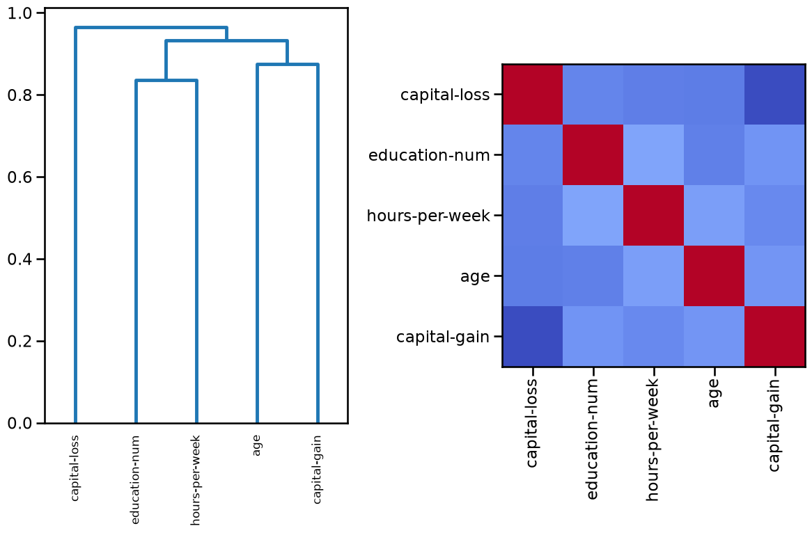
Using a diverging colormap such as “coolwarm”, the softer the color, the less (anti)correlation between features (no correlation is mapped to white color). In this case dark blue represents strong negative correlations and dark red means strong positive correlations. Indeed, any feature is perfectly correlated to itself.