Linear models for classification#
In regression, we saw that the target to be predicted is a continuous variable. In classification, the target is discrete (e.g. categorical).
In this notebook we go back to the penguin dataset. However, this time the task is to predict the penguin species using the culmen information. We also simplify our classification problem by selecting only 2 of the penguin species to solve a binary classification problem.
Note
If you want a deeper overview regarding this dataset, you can refer to the Appendix - Datasets description section at the end of this MOOC.
import pandas as pd

penguins = pd.read_csv("../datasets/penguins_classification.csv")

# only keep the Adelie and Chinstrap classes
penguins = (
    penguins.set_index("Species").loc[["Adelie", "Chinstrap"]].reset_index()
)
culmen_columns = ["Culmen Length (mm)", "Culmen Depth (mm)"]
target_column = "Species"
We can quickly start by visualizing the feature distribution by class:
import matplotlib.pyplot as plt

for feature_name in culmen_columns:
    plt.figure()
    # plot the histogram for each specie
    penguins.groupby("Species")[feature_name].plot.hist(alpha=0.5, legend=True)
    plt.xlabel(feature_name)
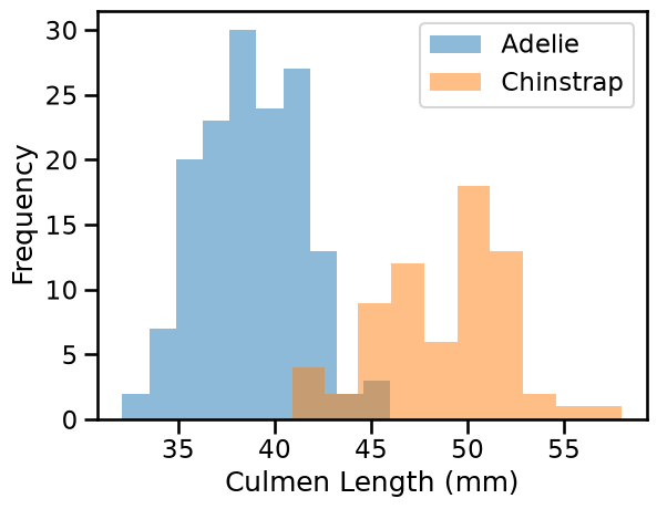
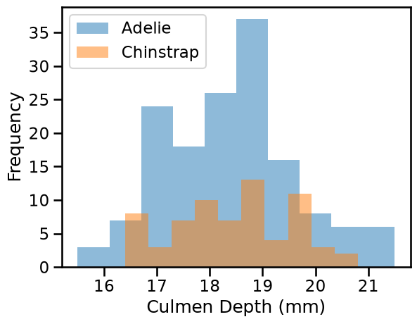
We can observe that we have quite a simple problem. When the culmen length increases, the probability that the penguin is a Chinstrap is closer to 1. However, the culmen depth is not helpful for predicting the penguin species.
For model fitting, we separate the target from the data and we create a training and a testing set.
from sklearn.model_selection import train_test_split

penguins_train, penguins_test = train_test_split(penguins, random_state=0)

data_train = penguins_train[culmen_columns]
data_test = penguins_test[culmen_columns]

target_train = penguins_train[target_column]
target_test = penguins_test[target_column]
The linear regression that we previously saw predicts a continuous output. When the target is a binary outcome, one can use the logistic function to model the probability. This model is known as logistic regression.
Scikit-learn provides the class LogisticRegression which implements this
algorithm.
from sklearn.pipeline import make_pipeline
from sklearn.preprocessing import StandardScaler
from sklearn.linear_model import LogisticRegression

logistic_regression = make_pipeline(StandardScaler(), LogisticRegression())
logistic_regression.fit(data_train, target_train)
accuracy = logistic_regression.score(data_test, target_test)
print(f"Accuracy on test set: {accuracy:.3f}")
Accuracy on test set: 1.000
Since we are dealing with a classification problem containing only 2 features, it is then possible to observe the decision function boundary. The boundary is the rule used by our predictive model to affect a class label given the feature values of the sample.
Note
Here, we use the class DecisionBoundaryDisplay. This educational tool allows
us to gain some insights by plotting the decision function boundary learned by
the classifier in a 2 dimensional feature space.
Notice however that in more realistic machine learning contexts, one would typically fit on more than two features at once and therefore it would not be possible to display such a visualization of the decision boundary in general.
import seaborn as sns
from sklearn.inspection import DecisionBoundaryDisplay

DecisionBoundaryDisplay.from_estimator(
    logistic_regression,
    data_test,
    response_method="predict",
    cmap="RdBu_r",
    alpha=0.5,
)
sns.scatterplot(
    data=penguins_test,
    x=culmen_columns[0],
    y=culmen_columns[1],
    hue=target_column,
    palette=["tab:red", "tab:blue"],
)
_ = plt.title("Decision boundary of the trained\n LogisticRegression")
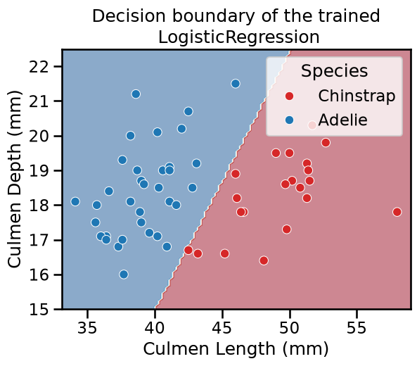
Thus, we see that our decision function is represented by a straight line separating the 2 classes.
For the mathematically inclined reader, the equation of the decision boundary is:
coef0 * x0 + coef1 * x1 + intercept = 0
where x0 is "Culmen Length (mm)" and x1 is "Culmen Depth (mm)".
This equation is equivalent to (assuming that coef1 is non-zero):
x1 = coef0 / coef1 * x0 - intercept / coef1
which is the equation of a straight line.
Since the line is oblique, it means that both coefficients (also called weights) are non-null:
coefs = logistic_regression[-1].coef_[0]
weights = pd.Series(coefs, index=[f"Weight for '{c}'" for c in culmen_columns])
weights
Weight for 'Culmen Length (mm)'    3.724791
Weight for 'Culmen Depth (mm)'    -1.096371
dtype: float64
You can access pipeline
steps
by name or position. In the code above logistic_regression[-1] means the
last step of the pipeline. Then you can access the attributes of that step such
as coef_. Notice also that the coef_ attribute is an array of shape (1,
n_features) and then we access it via its first entry. Alternatively one
could use coef_.ravel().
We are now ready to visualize the weight values as a barplot:
weights.plot.barh()
_ = plt.title("Weights of the logistic regression")
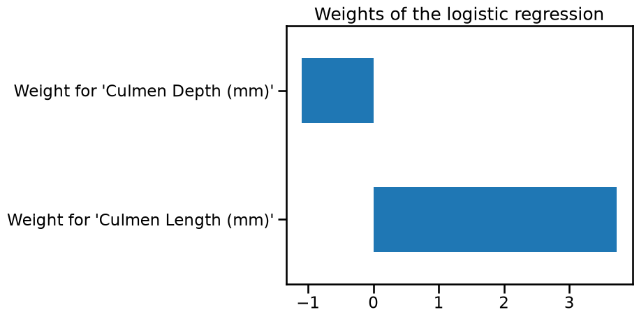
If one of the weights had been zero, the decision boundary would have been either horizontal or vertical.
Furthermore the intercept is also non-zero, which means that the decision does not go through the point with (0, 0) coordinates.
(Estimated) predicted probabilities#
The predict method in classification models returns what we call a “hard
class prediction”, i.e. the most likely class a given data point would belong
to. We can confirm the intuition given by the DecisionBoundaryDisplay by
testing on a hypothetical sample:
test_penguin = pd.DataFrame(
{"Culmen Length (mm)": [45], "Culmen Depth (mm)": [17]}
)
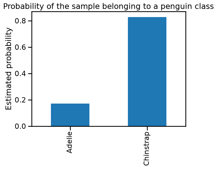
logistic_regression.predict(test_penguin)
array(['Chinstrap'], dtype=object)
In this case, our logistic regression classifier predicts the Chinstrap species. Note that this agrees with the decision boundary plot above: the coordinates of this test data point match a location close to the decision boundary, in the red region.
As mentioned in the introductory slides 🎥 Intuitions on linear models,
one can alternatively use the predict_proba method to compute continuous
values (“soft predictions”) that correspond to an estimation of the confidence
of the target belonging to each class.
For a binary classification scenario, the logistic regression makes both hard and soft predictions based on the logistic function (also called sigmoid function), which is S-shaped and maps any input into a value between 0 and 1.
y_pred_proba = logistic_regression.predict_proba(test_penguin)
y_pred_proba
array([[0.1714923, 0.8285077]])
More in general, the output of predict_proba is an array of shape
(n_samples, n_classes)
y_pred_proba.shape
(1, 2)
Also notice that the sum of (estimated) predicted probabilities across classes
is 1.0 for each given sample. We can visualize them for our test_penguin as
follows:
y_proba_sample = pd.Series(
    y_pred_proba.ravel(), index=logistic_regression.classes_
)
y_proba_sample.plot.bar()
plt.ylabel("Estimated probability")
_ = plt.title("Probability of the sample belonging to a penguin class")
Warning
We insist that the output of predict_proba are just estimations. Their
reliability on being a good estimate of the true conditional class-assignment
probabilities depends on the quality of the model. Even classifiers with a
high accuracy on a test set may be overconfident for some individuals and
underconfident for others.
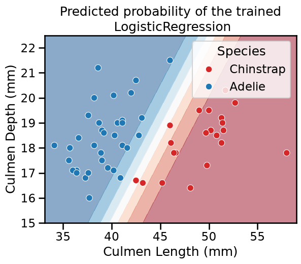
Similarly to the hard decision boundary shown above, one can set the
response_method to "predict_proba" in the DecisionBoundaryDisplay to
rather show the confidence on individual classifications. In such case the
boundaries encode the estimated probablities by color. In particular, when
using matplotlib diverging
colormaps
such as "RdBu_r", the softer the color, the more unsure about which class to
choose (the probability of 0.5 is mapped to white color).
Equivalently, towards the tails of the curve the sigmoid function approaches its asymptotic values of 0 or 1, which are mapped to darker colors. Indeed, the closer the predicted probability is to 0 or 1, the more confident the classifier is in its predictions.
DecisionBoundaryDisplay.from_estimator(
    logistic_regression,
    data_test,
    response_method="predict_proba",
    cmap="RdBu_r",
    alpha=0.5,
)
sns.scatterplot(
    data=penguins_test,
    x=culmen_columns[0],
    y=culmen_columns[1],
    hue=target_column,
    palette=["tab:red", "tab:blue"],
)
_ = plt.title("Predicted probability of the trained\n LogisticRegression")
For multi-class classification the logistic regression uses the softmax function to make predictions. Giving more details on that scenario is beyond the scope of this MOOC.
In any case, interested users are referred to the scikit-learn user guide
for a more mathematical description of the predict_proba method of the
LogisticRegression and the respective normalization functions.